Welcome to Part 2 of our look at the importance of hot starts. If you haven’t already, read Part 1 first. We’ll wait for you to get back.
Last time, I looked at how teams fared at season’s end after starting the season with a particular record, varying the data by looking at starts of varying lengths. While I pointed out general trends in the data (as well as the exceptions that proved the rule), I did not sum up the data concisely into a single, coherent formula to predict a team’s final record. That’s what today’s article is about. In Part 3–yes, there will be a Part 3–I want to examine how the interaction between a team’s record at the start of the season, and its record the previous season, affects its final winning percentage.
WARNING: This article contains lots of graphs, formulas, and other items found in an egghead’s tool kit. If numbers aren’t your thing, you’re welcome to scroll down to the end and skip to the conclusions. For those of you who like to know what went into the batter (no, not that kind of batter), read on.
As I pointed out in Part 1, there are measurable differences in the final performances of teams based on their record after even just 10 games. The following graph compares a team’s winning percentage after 10 games (meaning there are only 11 possible records, ranging from 0-10, 1-9, etc, all the way to 10-0) to its final winning percentage. The graph shows plots for all 1300-odd teams in the study:
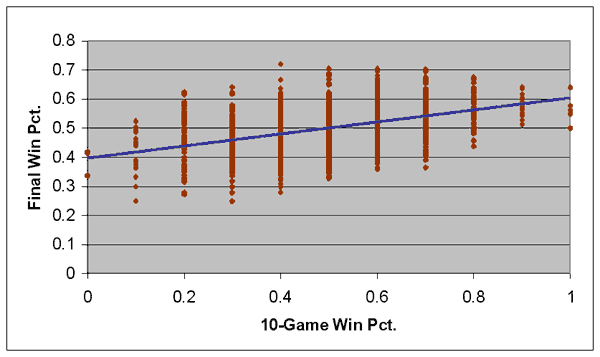
The blue line represents a “best-fit” linear regression that comes closest to representing the fortunes of every team in a single formula. That formula, expressed numerically, is:
Y = .398 + .205 * X r2 = 0.197
Where Y is the team’s final winning percentage, and X represents the team’s winning percentage after 10 games.
There are two numbers in that formula that are important to understand. The .398 figure represents what was called a “Y-intercept” in your 8th-grade math class, while the .205 figure represents the “slope”. Essentially, the Y-intercept represents what a team’s overall winning percentage would be if their initial winning percentage was 0; i.e. they started 0-10. An 0-10 team would therefore be projected to win 39.8% of their games, which corresponds to about a 65-97 record. The slope represents the impact that an increase in the team’s winning percentage at the start would have on their final winning percentage. A 1-9 team has a .100 winning percentage; multiply .100 by .205 and you get .0205, so you would expect a 1-9 team to finish with a winning percentage .0205 better than the 0-10 team–which comes out to .4185, or about a 68-94 record.
We’ll get to the meaning of r2 in a moment.
Now compare the previous graph to this one, which looks at the same data after 40 games:
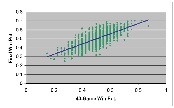
Two differences should be apparent with this graph: The angle of the “best-fit” line is steeper than in the previous graph, and the individual data points are clustered closer together. Very few of the data points are located far away from the best-fit line, whereas in the 10-game graph, the data points were much more scattered, with many data points occurring far from the best-fit line.
Here is the linear regression formula for the 40-game graph:
Y = .2145 + .571 * X r2 = 0.533
The Y-intercept is much lower than in the 10-game formula, while the slope is much higher. What this means, in a nutshell, is that changes in a team’s winning percentage at the 40-game mark are much more meaningful than after 10 games. This should make intuitive sense. A 100-point swing in winning percentage after 40 games is the difference between a 20-20 team and a 24-16 team, which ought to be more significant than the difference between a team that starts 5-5 and one that starts 6-4.
And as the slope of the line increases, its Y-intercept must decrease, because the line is “centered” around the .500 mark on both axes. (If you plug .500 into either formula, you should get .500 out the other side, give or take a thousandth of a point.) The centering of the line around .500 corresponds to the principle of regression to the mean, which exists in baseball as in virtually all measurable things. As a whole, teams that play .700 ball at the start of the season are not going to keep up that pace all season. But as the Y-intercept drops, the centering force weakens, and teams tend to finish closer to the initial pace. Obviously, teams that start 28-12 are likely to finish closer to .700 than teams that start 7-3.
One other point that’s important to make: You see how the “r2” figure is much greater for the 40-game graph than for the 10-gamer? That figure represents the coefficient of determination of the data, or in plain English, how closely the best-fit line predicts the actual data. As I mentioned before, the data points in the 40-game graph appear much more clustered together than in the 10-game graph. Again, this is intuitive; teams are much more likely to play at or close to their true level over a 40-game stretch than over just 10 games.
The r2 value in the 10-game graph is very small, .197, indicating that a team’s initial winning percentage does not do a very good job of predicting its final record. In the 40-game graph, the r2 of .533 is much higher and implies, obviously, that a team’s winning percentage after 40 games is much more indicative of what its final record is going to be.
(Whew. Breathe.)
To save space, I won’t display best-line graphs for every number of games in the study. But below, I’ve listed the formula at every five games, up to 50 games.
After 5 games:  Y = .4527 + .0952 * X   r2 = .079
After 10 games: Y = .3983 + .2053 * X   r2 = .197
After 15 games: Y = .3612 + .2779 * X   r2 = .254
After 20 games: Y = .3186 + .3630 * X   r2 = .339
After 25 games: Y = .2904 + .4174 * X   r2 = .383
After 30 games: Y = .2583 + .4827 * X   r2 = .449
After 35 games: Y = .2412 + .5183 * X   r2 = .475
After 40 games: Y = .2145 + .5709 * X   r2 = .533
After 45 games: Y = .1950 + .6096 * X   r2 = .563
After 50 games: Y = .1719 + .6568 * X   r2 = .608
The trend is clear: The more games a team has played at the start of the season, the more significance their record has (as demonstrated by the increasing slopes), the less centered around .500 their overall record is (as demonstrated by the decreasing Y-intercepts), and the more precisely their final record can be projected (as demonstrated by the increasing r2 figures).
Let’s give one of these formulas a test run, using the 1984 Tigers’ legendary 35-5 start. Using the 40-game formula:
Y = .2145 + .5709 * .875
Y = .2145 + .4995
Y = .7140
So the Tigers would have been projected to finish with a .714 winning percentage, which translates to 115.7 wins. They only finished with 104, but I think that 115.7 wins is a very good estimation, given that: 1) The Tigers had the best 40-game start in history, and it’s not close–only one other team in my study (the 1939 Yanks) won more than 31 of their first 40 games; 2) as the 1998 Yankees and 2001 Mariners have shown, it is, in fact, possible for a team in the modern era to win around 115 games. Whether or not the Tigers would have finished with a better record had they not wrapped up the AL East by mid-season is a question I can’t answer, but it’s worth noting that when their games started having meaning again–in the postseason–Detroit went 7-1.
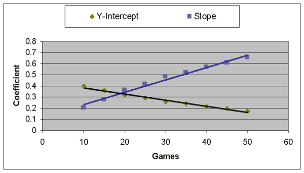
We’re only halfway to our goal. What we want is a single formula that applies for all teams, no matter how many games they have played, so you don’t have to look up a chart to see what formula applies at the 37-game mark, for instance. What’s clear from the above numbers is that the slope and Y-intercept of a formula are dependent on the number of games the team has played. So let’s plot another graph, looking at how the slope and Y-intercepts change depending on the number of games played:
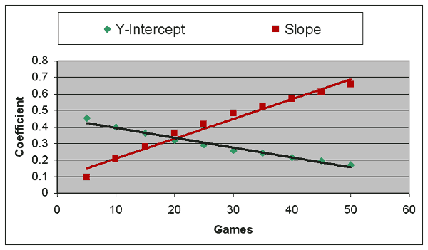
As you can see, the two plots on this graph are significantly more related than in the graphs above–the best-fit line nearly runs through all the data points. The r2 of this formula is .975, which is very close to the maximum r2 of 1. (Technical note: there are different r2 values for each of the best-fit lines, but in these graphs those values are almost identical, so I’ll just refer to a single value from this point on.)
There is one problem with the graph, though. Both data sets tend to curl as you approach zero games–the 5-game data points have the worst fit of any of the points on the graph. Which suggests a straight-line approach may not be the best way to come up with a best-fit line, because if you extend the line all the way to zero, funny things happen. The formula based on this best-fit line would suggest that a 1-0 team should have a .551 winning percentage, when we know from my previous article that teams starting 1-0 only had a composite winning percentage of .510.
There are many ways to get around this problem, and the most direct method is simply to change the X-axis–that is, rather than using games played as your independent variable, use some derivative of games played. After playing with the numbers for a lot longer than I should have, I can tell you that using the square root of games played as the independent variable yields the best fit, as the following graph shows:
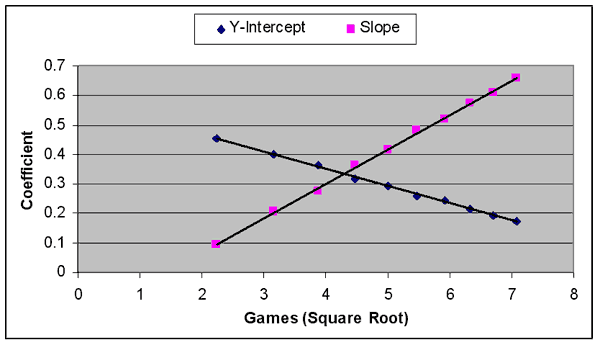
The r2 of the best-fit lines on this graph are .999, which is about as close to perfect as we can get. Which means we should have our perfect formula.
We should…except that it looks like this:
Y = 0.5818 - (.058 * SQRT(G)) + ((.1158 * SQRT(G)) - .1623) * X)
Where X is the team’s winning percentage, and G is the number of games played.
That, my friends, is one ugly looking formula. You’re welcome to use it if you like, but I’m going to keep looking for something a little simpler, even if it means losing a tiny bit of accuracy.
In the end, I elected to cheat a little, and simply deleted all data before the 10-game point from the study completely. Essentially, I’m biting the bullet and stating that it’s not even worth looking at a team’s start until they’ve played 10 games. But from the 10-game point to the 50-game point, the graph looks more like a straight line:
The r2 of this graph is .983, which means we’ve shaved about a third of the error off the graph simply by eliminating that troublesome 5-game data. Best of all, it means we now have a straightforward formula that we can use.
(Technical note for the mathematicians in the group: the below formula was actually derived from a multivariate linear regression of all the data in the original study, with winning percentage and (winning percentage * games) as the independent variables. Many thanks to Jeff Hildebrand for his assistance.)
That formula is:
Y = 0.4428 - (.0057 * G) + (X * (.1145 + (.0114 * G))
Yes, that still looks about as appealing as a Jack Nicholson/Kathy Bates naked hot tub scene. Let’s simplify it a little:
Y = 0.4428 + (X * .1145) + (G * .0057) + (G * X * .0114)

Y = 0.4428 + (X * .1145) + [(2X - 1) * G * .0057]
Which, after knocking off a not-so-significant significant figure here and there, gives us our final formula:
Y = 0.443 + (X * .114) + [(2X - 1) * G * .0057]
All right, someone invite the mathophobes back in the room. Let’s explain this formula a bit.
Essentially, there are three terms to the formula, which are:
-
0.443: This is a constant, which roughly corresponds to the expected winning percentage of a team with a .000 winning percentage. If that number seems awfully high for a winless team, don’t worry: An adjustment is coming up.
-
(X * .114): This factor adjusts the team’s expected winning percentage upwards depending on their current winning percentage. So an undefeated team would be expected to finish at (.443 + .114), or a .557 winning percentage. Again, for a team that starts 18-0, that seems like a pretty conservative estimate. (Or it would if a team had ever started 18-0.) But that’s what the third term is for.
-
[(2X – 1) * G * .0057]: This funny-looking term is actually the key to making the entire formula work. That (2X – 1) figure works out to a positive number for teams over .500, a negative term for teams under .500, and for teams exactly at .500, 2X–1 equals zero, wiping out the entire term entirely.
What this means is that any team at .500 would be expected to finish at (.443 + (.114 * .5)), or (.443 + .057), or .500 exactly. Which makes sense. But it also means that teams over .500 will see their expected winning percentage increased by a factor of how far they are over .500, as well as the number of games they have played.
Let’s look at two teams with identical winning percentages, a team that starts 7-3 and one that starts 21-9. Both teams, by virtue of their .700 winning percentage, would have identical first terms (.443) and second terms (.7 * .114, or .0798). But the final terms would be different:
7-3 projects to:  .443 + .0798 + [0.4 * 10 * .0057] = .5228 + .0228 = .5456
21-9 projects to: .443 + .0798 + [0.4 * 30 * .0057] = .5228 + .0684 = .5912
The exact opposite effect occurs on sub-.500 teams; the more games they’ve played, the more their expected winning percentage will drop.
Going back to the formula again:
Y = 0.443 + (0.114 * X) + [(2X-1) * G * .0057]
But wait. If X is winning percentage, it can be expressed as W/G, right? So (2X-1) = 2(W/G) – 1.
(2X-1) * G * .0057
((2W/G)-1) * G * .0057
(2W-G)/G) * G * .0057
(2W-G) * .0057
And since G = wins + losses…(2W-G) * .0057 becomes
(2W - (W+L)) * .0057
(2W - W - L) * .0057
(W - L) * .0057
Which means our final formula is:
Y = 0.443 + (0.114 * X) + [(W-L) * .0057]
Where X = current winning percentage and (W-L) is wins – losses, or simply games above .500. It’s not exactly the Pythagorean formula (the real one or the baseball one, take your pick), but it’s not nearly as complicated as wading through all those charts and graphs, is it?
Disclaimer: Keep in mind that this formula is only valid after a team has played 10 games. On the other side of the graph, I make no claims that the formula works beyond 50 games either. Actually, you can see that it shouldn’t, because if you continue the lines far enough, eventually the slope will exceed one and the Y-intercept will go below zero, which is impossible. (If it wasn’t, eventually we’d be projecting the Tigers to finish with 170 losses.)
So, to answer the question that first sparked this entire series: Where should we expect a certain collectively-possessed-by-aliens Midwestern team to finish? If that Midwestern team happens to be, say, 17-5, then we can calculate their expected finish to be:
Y = 0.443 + (.114 * .773) + [(17 - 5) * .0057]
Y = 0.443 + .088 + (12 * .0057)
Y = 0.531 + .0684
Y = 0.5994
Which is to say, the Royals should finish with approximately 97.1 wins.
Hmmm. There’s something fishy about that result. Namely: Shouldn’t it trouble us slightly that we’re projecting the Royals’ finish based on the first 22 games of the season, yet we’re not taking into account their previous 162 games–that is, last year’s record–at all? Shouldn’t the fact that the Royals lost 100 games last year dampen our expectations slightly?
It should. And I’ll cover that very topic next time. If there is a next time. I have this exam to…oh, never mind.
Thank you for reading
This is a free article. If you enjoyed it, consider subscribing to Baseball Prospectus. Subscriptions support ongoing public baseball research and analysis in an increasingly proprietary environment.
Subscribe now