Patrick: Comrades, I assemble you once again to fulfill your divine mandate: to assess and rank the aesthetic value of various early nineties baseball cards. Last year, as you may recall, we explored the year 1990, an era of reckless youth and posturing. Moving forward three years, things have changed. Still riding the hobby’s bubble, the price of a pack has effectively doubled, and production values have increased noticeably. And at the same time… we have changed in that short span. We’ve survived middle school as a country; the Cold War is over, Russia no longer a threat. These are the designs of a game of baseball in 1993 that is sure of itself, that nothing bad could ever happen to.
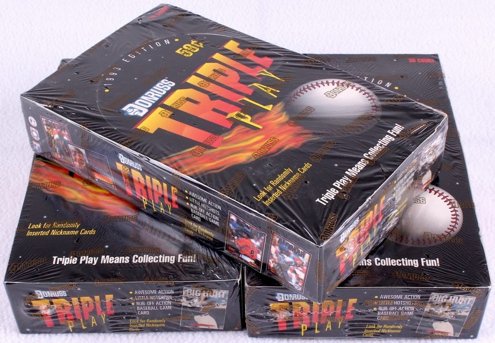
Twelve editions to choose from this time: most of the base card companies have created “premium” subsets to go along with their base issue (Leaf Studio, Fleer Ultra, Score Pinnacle, Topps Stadium Club). Also, around this time, mankind unlocked the lost technology of foil, the current designator of Quality Product.
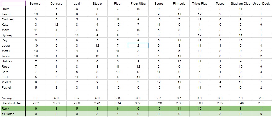
Here are the results of the vote:
So, to begin with the positives: is there a design choice in any of these cards that particularly resonates with you?
Roger: So, I initially said I don’t really care about baseball cards. I realized I have definitely seen *all* of these 1993 cards in my youth. What actually happened was my father and I one year in the mid 1990s opted to not spend the extra 10 bucks to have the card shop put the entire Topps set in their proper order, and we spent an entire day organizing the 800 or so cards by their serial numbers, or whatever the term was. It wasn’t a miserable existence so much as an incredibly tedious one, and we both agreed by the end of it that he wouldn’t be a cheapie and spring for the extra ten next time. I never asked for a set again though. It was either because of that incident or because I got overwhelmed with how many different card brands existed and got an inaugural case of crippling anxiety over the fact I could never collect them all. Or something.
Roger: Anyway, I ranked these bad boys based on how hard they tried. The harder they tried, the lower I ranked them. You think Soundgarden was sweating graphic design during the Grunge era? Come on. The gold medal on the Leaf card is for Excellence in Effort, right?
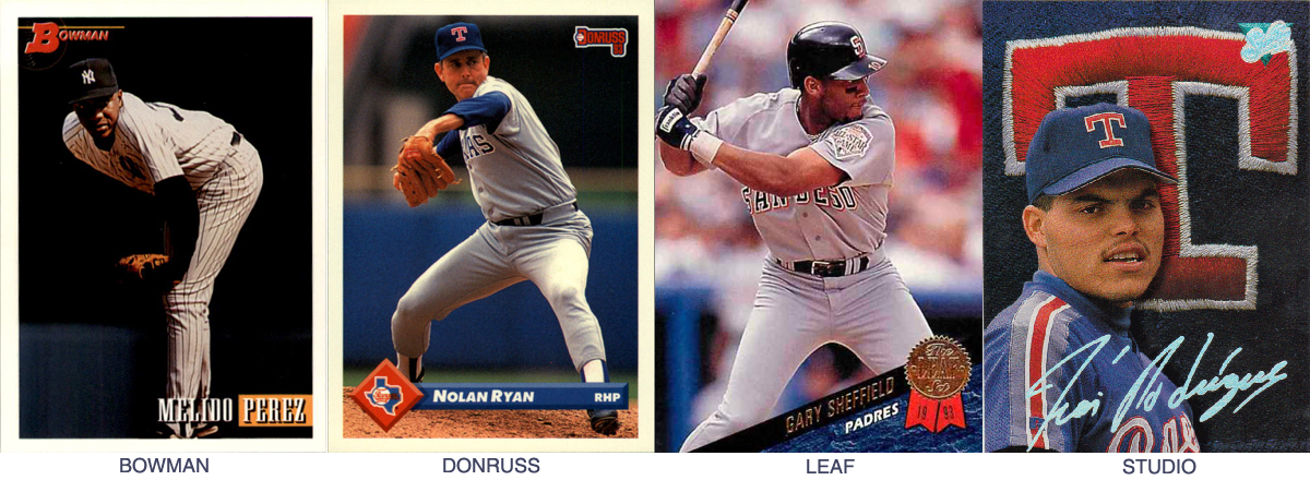
Beth: To my rookie eye, they didn’t try very hard. I looked at a set of Bowman cards because they were the first on the ballot list, and I said, “Oh, those are nice. I like minimalism. Clean lines. Well done, Bowman.” Then I looked at a set of Donruss cards and had to confirm that I wasn’t still looking at Bowman cards. I wasn’t. The Donruss cards, while pleasantly minimalist, were Bowman twins. I can see minor differences in design choices in all the cards, but nothing worth noting. Far more fun to compare and contrast Clinton and Gingrich. More worthwhile to compare and contrast the lives and fortunes of those with healthcare and those without. 1993 was depressing, but in these cards, art was ignoring life.
Beth again: Actually, they reflect one facet of American life in 1993 quite well, the one of hands clapped over ears, eyes closed, whispering quietly, “There is no labor conflict. There is no labor conflict. There is no class struggle in America.”
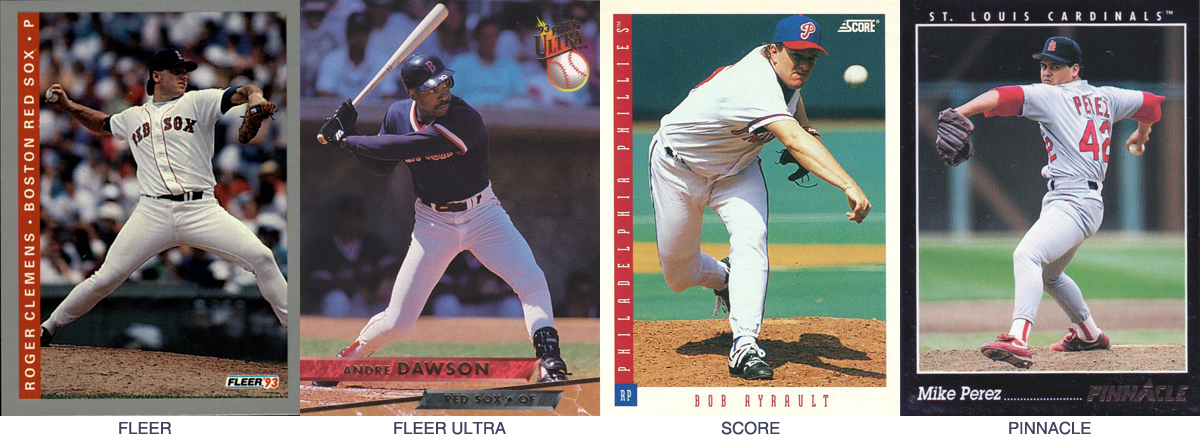
Jason: There is, however, conflict and struggle among the Short Relief staff. I’m interested in the winner of the Most Divisive category, which is the Fleer Ultra. Nobody ranked it first, sixth, or eighth, but the other nine rankings were all covered. I put it in the middle because I like that it’s borderless, and I like that it’s different, but I hate that it’s utterly illegible, and not even identifiably a baseball card. If that weren’t a Hall of Fame player, we might have no idea who it is, or what team he plays for.
Mary: I, too, took off major points for Fleer Ultra’s illegibility. In fact, that’s how I ranked most of them, because, as much fun as it would be to receive a package of cards and spend hours trying to figure out which players they depict, I value my time too much to even contemplate doing so. Font choice matters, people!
Patrick: Not that this is part of the criteria, but Ultra’s 1993 design is just a clumsy facsimile of their previous year’s effort.
Roger: More like Fleer Extra.
Patrick: Twelve cards, eight with borders: five white, two black, one gray. 1993 baseball cards look like 2018 automobiles. By the end I was grateful for even a flash of team color. But while white borders will prove the standard going forward, I like the crisp black of Pinnacle, plus those table-of-contents dots that run across the bottom for no real good reason. It’s not an interesting baseball card, but at least it looks like a card, not just a photograph that someone wrote a name on.
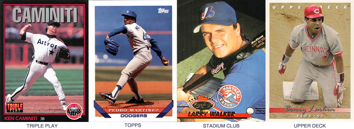
Kate: I too liked the Pinnacle for its strong contrast, although I believe it is outflanked here by the stunning chiaroscuro of the Bowman. I would be happy to purchase either of the two as wall-hangings. Speaking of which, I am anguished I am the one person who strongly favored the Triple Play, which looks like a miniaturized version of a Costacos Brothers poster but without the pun-y headline, which to me makes it even better, like if one of the brothers had been Ron Swanson.
Patrick: I feel like in 2018 that giant last name would work using the Players Weekend nicknames. But with the regular last name, also sitting on the bottom of the card? I’m imagining a Doug Jones card with a big silver “JONES” behind him and… I don’t think that’s what you guys were going for.
Jason: The Triple Play loses serious points for its logo as well. The whole aesthetic, with the black border, big name, and awful logo, is just too cereal box for me. It’s not a real card. It’s, to steal from Patrick, a Purina Cat Food card. Are there any names that would make the “big name at the top” design work? Maybe Ichiro?
Sussman: I had a boatload of Fleer 93s growing up and I loved the vertical off to the side. Made it so easy when you had a handful of them to see all the names. I forgot how much I enjoyed their aesthetic. It might be my favorite all time card layout. For me it was Fleer 93 and then [Rod Beck-sized gap] and then all the rest.
Patrick: I have a real hard time with sideways text. Which is weird, because I own bookshelves with books on them, and I haven’t rejected that. I accept my hypocrisy.
Kate: I also have a hard time with sideways text. We got away from cuneiforms for a reason, people.
Jason: The Score card is somehow 10 times harder to read than the Fleer. I think it’s the kerning. Is it the kerning?
Mary: It’s absolutely the kerning, plus the font itself is far too skinny/elongated, like butter scraped over too much bread. I love the sideways text, and Fleer has by far the best font. I wish the border didn’t occupy so much space, but it definitely is a card that has its stuff together and would be something I would be incapable of creating, unlike Studio.
Rachael: Everyone who didn’t vote Studio for their top pick is a coward. I will not be taking questions at this time.
Patrick: 1993 Studio isn’t just my favorite set of 1993, it might be one of my favorite baseball card designs ever. The rainbow foil signature – okay, it was still 1993. But the high-quality photography, the saturation of color, the hand-stitched logos of the caps and jerseys behind… that’s chef-finger-kissing level. Man, it’s so good.
Kate: I actually have a clear phone case with the 1993 Studio Edgar Martinez tucked into it so I can look at it all the time. The only reason I didn’t rank it higher is because I can’t get past how much I dislike this particular card with its bloated scales-of-justice T in the background and a poor shot of Iván Rodríguez where he looks like he’s just been approached by someone with a clipboard asking if he has a minute to talk about the environment. The Stadium Club is probably a less well-designed card, but I ranked it higher because I find this particular iteration more aesthetically pleasing, even though poor Larry Walker is being forced to squint into the sun.
Patrick: Okay, let’s stop dancing around the real story. It’s time for someone to explain all this love for Topps. What the hell are those diagonal lines at the bottom supposed to be? Those old stick-on picture mounting corners that no one has used since the seventies? And if so, why aren’t there any on the top? Wouldn’t the photo fall out? Or. Or! Explain how the photo sticks out from those diagonals at the corners, but then is hidden by the team name in the middle, which blends into the border, which is behind the photo, which… this is some low-grade Escher shit. Defend yourselves, cowards.
Sussman: I interpreted it as the top of the home plate and then some base line.
Sussman: Oh, you wanted a joke answer. It’s a jock strap.
Patrick: wait, what
Nathan: No, Matt is correct. That’s a baseline.
Patrick: A blue baseline. On top of a field that is… all… chalk?
Sussman: Oh, it’s horridly executed. It’s like a bunt back to the pitcher. But that’s what it looks like. You have to color it otherwise it’s too much white on white.
Sussman: Even for baseball.
Jason: It’s just a design element that pulls the whole card together and allows the eye to travel where it needs to travel. And it is lovely, understated, and classy. I mean, look at all the goshdang foil and nonsense on the other cards, and you’re out here complaining about diagonal lines and how they’re not symbols for anything. Not everything’s a symbol!!! Sometimes we just get to enjoy things!!!! I’m heated!!!!!
Nathan: The key point, and perhaps a clarifying one here – are we judging these cards looking back, with our modern eye? Or do we want the card that best captures the spirit of its time? The Topps cards are bad, no one denies this. [editor’s note: based on the rankings, literally everyone is denying this.] [author’s note: pipe down, Patrick.] However, as a child of the 90’s – again the era we are judging – I have inherently terrible taste, and I LOVE these. This proves they are in fact the best. The defense rests.
Sussman: This was, to me, a referendum on 90s aesthetics as a whole. That and fonts.
Patrick: In the end, I’m just happy that the much-maligned cursive of 1990 Donruss has risen to become the champion of 1993. The 90s got something right.
Thank you for reading
This is a free article. If you enjoyed it, consider subscribing to Baseball Prospectus. Subscriptions support ongoing public baseball research and analysis in an increasingly proprietary environment.
Subscribe now
I guess I'm the old man yelling at clouds.