You know about a lot of the things that happened this year. Home runs were down, a little—still the third-most in history—but strikeouts reached an all-time high. Over 40 percent of runs were scored via homers. There were only 42 complete games, the fewest in history. As recently as 1983, one team (the Tigers) had 42 complete games. As recently as 1908—OK, that wasn’t recent—one pitcher, Ed Walsh, had 42 complete games. Anyway, you probably know all of this. It isn’t news.
So I searched for some features of 2018 that might’ve eluded you. After all, the season went by quickly, and you were probably busy for a lot of it. Here’s what went on without drawing headlines.
Most Wild Pitches, Ever
I pointed out in this article last year that 2017 set a record for most wild pitches in a season. Here’s what happened this year.
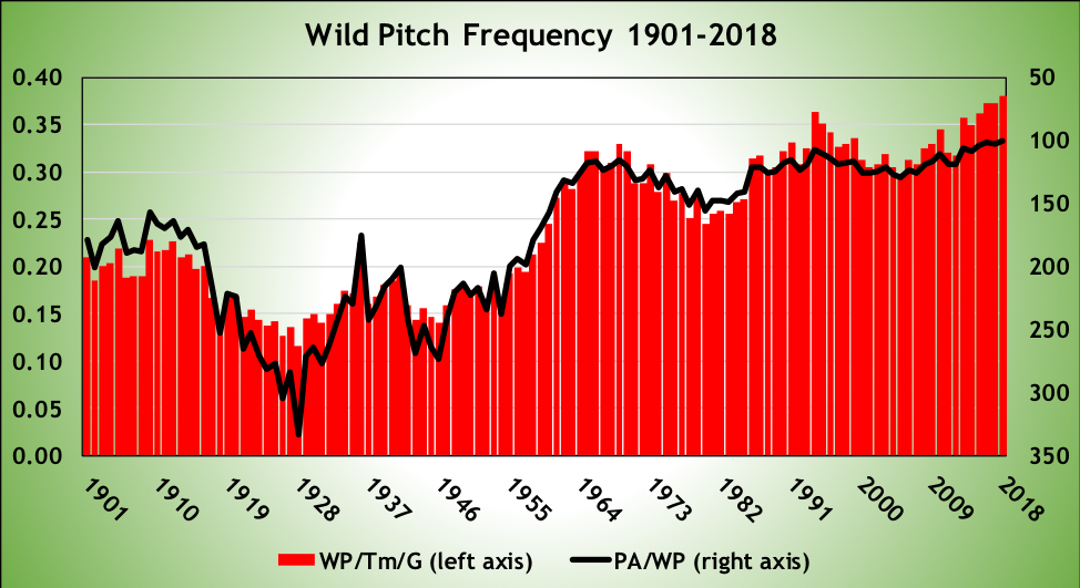
This graph looks at wild pitches two different ways. The red bars represent wild pitches per team per game. If you watched a game in 2018, you saw, on average, 0.7598 wild pitches. That broke the old record of 0.7449 set last year, which broke the record of 0.7446 set the year before. Or, if you look at it on a per-batter basis, there was a wild pitch once every 100.2 plate appearances, the lowest it’s ever been. The old record was 102.1, set in 2016, followed by 2017’s 102.4 and 2015’s 104.5.
There are two obvious reasons for the increase. One is velocity. It’s harder to catch a 95 mph pitch than an 85 mph pitch. The second is strikeouts. When pitchers get ahead in the count, as they do when they get a strikeout, they target the periphery of the strike zone, trying to get the batter to chase. When those pitches miss, they may wind up by the backstop. That’s also reflected in …
… Most Hit Batters, Ever (Or At Least Since 1901)
Same graph format as the last one.
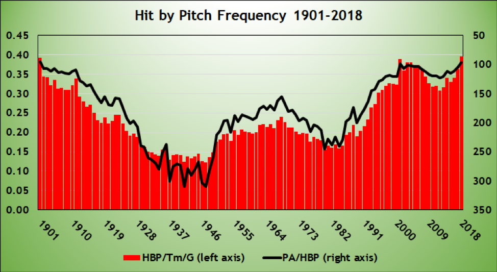
The 10 seasons with the most hit batters per team per game:
| Season | HBP/Team/Game |
| 2018 | 0.395 |
| 1901 | 0.393 |
| 2001 | 0.389 |
| 2004 | 0.381 |
| 2003 | 0.380 |
| 2006 | 0.374 |
| 2005 | 0.370 |
| 2017 | 0.363 |
| 2007 | 0.361 |
| 2002 | 0.360 |
Or, if you prefer, the 10 seasons with the fewest number of plate appearances per hit batter:
| Season | PA/HBP |
| 1901 | 95.7 |
| 2018 | 96.3 |
| 2001 | 98.9 |
| 2003 | 101.4 |
| 2004 | 101.9 |
| 2006 | 103.5 |
| 2005 | 103.7 |
| 2017 | 105.1 |
| 1903 | 106.85 |
| 2002 | 106.88 |
Look, I’ve been sounding the alarm on this long enough that I’m not going to link to everything I’ve written on the subject, just this opus. Commentators whine about how umpires won’t let pitchers pitch inside, Bob Gibson and Don Drysdale wouldn’t have let batters crowd the plate/hit home runs/showboat without retaliation, pitchers won’t enforce the game the way they should, blah, blah, blah. It’s all crap. Batters were hit by pitches more often in 2018 than in any year since 1901.
As with wild pitches, I think there are two pretty clear reasons: velocity and strikeouts. When batters are ahead in the count (specifically, 1-0, 2-0, 3-0, 2-1, or 3-1), they got hit in one of every 151 plate appearances, or 0.7 percent of plate appearances. In all other plate appearances, they got hit nearly twice as often, once every 88 plate appearances, 1.1 percent of the time. It’s pretty obvious why: When the pitcher is worried about issuing a walk, he’s going to target the zone. When the pitcher is en route to a strikeout, he’s going to try to get the batter to chase. If he’s trying to get the batter to chase on an inside pitch, and he misses a foot or so inside, there’s a chance the batter gets hit.
My concern has been that with more batters getting hit, with higher-velocity pitches, somebody’s going to get killed. I need to do more research on this, but I may have been overstating that. But the risk of broken wrists and hands and fingers, that’s at an all-time high.
Fewest Errors, Just About Ever
This one needs a little explanation. Here’s a chart of errors per team per game.
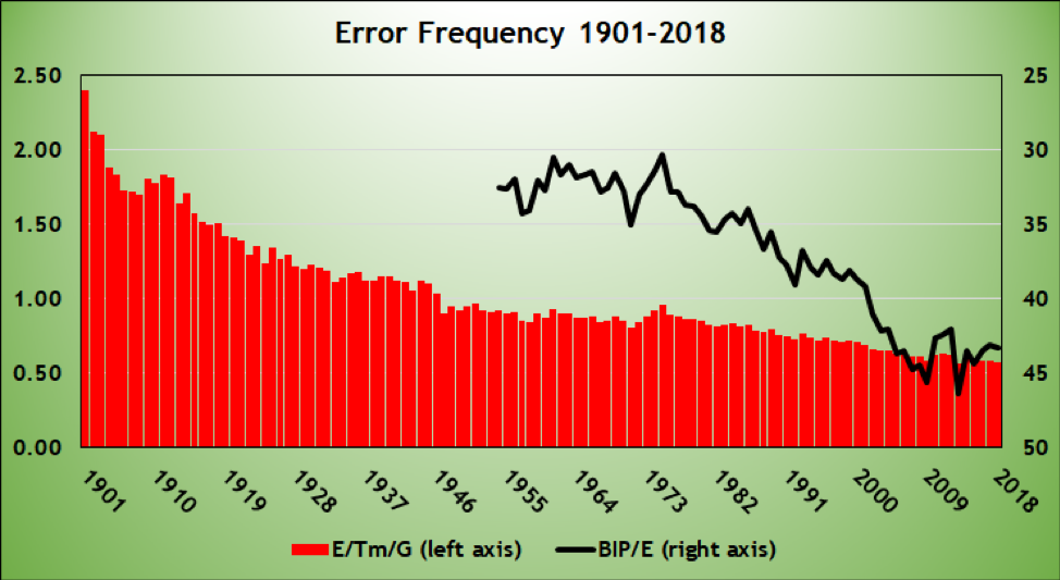
The red bars display a pretty steady decline in errors per team over baseball history. Here are the seasons with the fewest errors per team per game:
| Season | Errors/Team/Game |
| 2013 | 0.565 |
| 2018 | 0.574 |
| 2017 | 0.580 |
| 2015 | 0.583 |
| 2016 | 0.584 |
| 2009 | 0.588 |
| 2014 | 0.600 |
| 2008 | 0.611 |
| 2007 | 0.615 |
| 2012 | 0.619 |
Of the 12 years with the fewest errors per game, the years 2010-2018 account for nine of them. Maybe it’s generous official scorers, but I doubt it. Defenders are more athletic than ever.
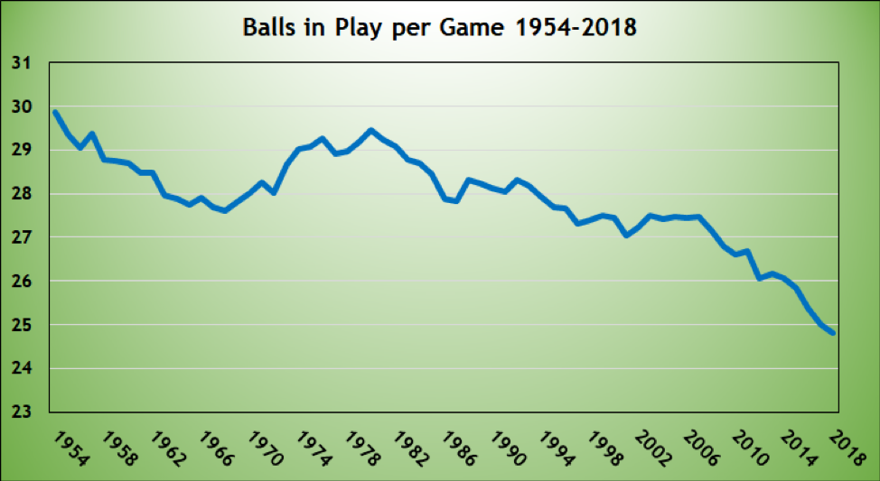
If you want to pick nits, though, you could argue those error counts require an asterisk. Yes, there are fewer errors, but there are fewer opportunities to make them. When a batter walks, or is hit by a pitch, or strikes out, or hits a home run, there is no chance for a fielder to make a play. Measured as a rate per balls in play (technical note: balls in play, for purposes of BABIP, consists of at-bats minus home runs and strikeouts, plus sacrifice flies; for these purposes, I’m adding sacrifice hits), 2018 ranks 10th, trailing nine seasons, all since 2006. That’s the black line in the chart above. That’s because while errors are down, balls in play are down, too. (Note that sacrifice fly data go back only to 1954.)
I’m guessing you already knew about this trend. No need to call it out for you.
I prefer the errors-per-game metric to errors per ball in play because you can get errors when there aren’t balls in play, like on errant pickoff throws. And as fans, we’re more likely to count errors by their totals in the box score than as a proportion of balls in play.
Starting Pitchers Aren’t Lasting As Long
As I’ve written, the Rays—well, really, it’s the adoption of The Opener, but let’s blame it on the Rays—have screwed up starter/reliever splits. Last year, I reported on how starters were pitching fewer innings, on average, than ever before, and reliever outings, on average, were increasing.
But, of course, when you have a starting pitcher, by design, pitch just one inning, and a subsequent reliever, by design, pitching five or six, you’re going to unduly exacerbate those trends. So we need new ways to look at this. I mean, I could tell you that the average starting pitcher lasted only 5.36 innings in 2018, the first year in which the average outing was less than five-and-a-half innings. Or I could tell you that the average reliever outing lasted 1.07 innings in 2018, the most since 2008. But given how Openers have muddied the waters, that’s not all that interesting.
So let’s look at it a different way: How often do starting pitchers reach an innings threshold? Ignore those Ryne Stanek starts for Tampa Bay; how prevalent are Jacob deGrom and Corey Kluber (the only pitchers with 20 or more starts lasting seven or more innings) starts?
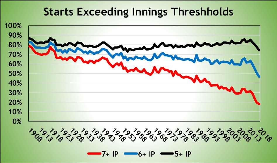
In baseball history, the four seasons with the lowest proportion of starters pitching at least seven innings are, in order, 2018, 2017, 2016, and 2015. The four seasons with lowest proportion of starters pitching at least six innings are, in order, 2018, 2017, 2016, and 2015. The 74 percent of starters who lasted at least five innings in 2018 are only the third-lowest proportion ever, but the figure’s declined by over two percent per year for four straight years. This trend hasn’t run its course.
The Sudden Demise Of Quality Starts
Quality starts—defined as any start lasting six or more innings in which the pitcher allows three or fewer earned runs—have long been derided in some circles. Three runs in six innings, that’s a 4.50 ERA! How can you call that quality? Well, in 2018, teams whose starting pitchers had quality starts won 68.3 percent of their games—that’s a 111-51 pace—so they’re pretty good.
And they’re falling off a table.
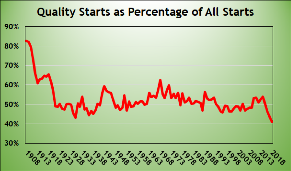
As you might imagine, quality starts are negatively correlated to the scoring environment. There were a lot more quality starts in The Year of the Pitcher, 1968 (63 percent), when teams scored 3.42 runs per game, than in 2000 (46 percent), when scoring hit 5.14 runs per team per game.
So when scoring increased in 2015, it wasn’t a shock that the percentage of quality starts declined from 54 percent to 50 percent. Scoring was up in 2016 as well, and quality starts fell to 47 percent. More scoring in 2017, and quality starts hit just 44 percent, the second-lowest proportion ever, trailing only the record-setting 1930 (5.55 runs per team per game) season. Finally, scoring fell in 2018, by 0.20 runs, to 4.45 per team per game. And quality starts … plunged to an all-time low of 41 percent of all starts.
Hate quality starts? Well, it looks as if you’re going to be watching fewer and fewer of them.
Fewer One-Inning Saves, But Let’s Not Get Carried Away
Ever since 1988, when Oakland manager Tony La Russa deployed his closer, Dennis Eckersley, to pitch exactly one inning in save situations, the one-inning save has become the norm. Like most origin stories, this one isn’t entirely true, but let’s not quibble.
And then, the new narrative goes, Andrew Miller was the 2016 ALCS MVP by getting five, six, four, and eight outs in four relief appearances, allowing no runs and striking out 56 percent of the batters he faced. Suddenly, managers thought: Hey, maybe I can use my closer for more than an inning!
This origin story, too, isn’t entirely true. The nadir for pitchers going more than an inning was two years earlier, in 2014, when only six percent of saves lasted more than three outs. It rose to nine percent the next two seasons. And following the 2016 postseason, which featured eight saves of more than three outs (three by Cody Allen, two by Kenley Jansen, and one each by Miller, Aroldis Chapman, and Roberto Osuna), the proportion spiked to 13.6 percent. It rose further, to 13.8 percent, this year.
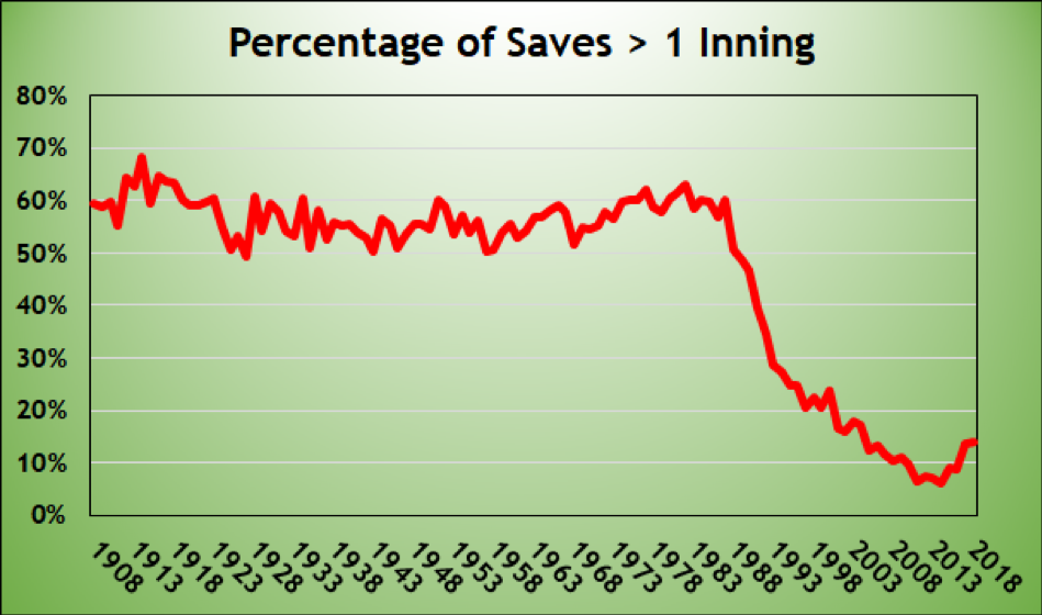
So multi-inning saves are back? Well, hang on. There have been 50 seasons since saves entered the rulebook in 1969. The 2018 season ranks only 37th in the percentage of saves lasting more than four outs. The years with a lower proportion? Each of the years 2005 to 2017. That’s it. Long saves are up, but only relative to the last 14 years.
Oh My God! They Killed Bunting!
I used the exact same heading, describing the exact same trend, the last two seasons. But hey, good enough for South Park, good enough for me. And it gives me a chance to reproduce what might be my favorite baseball graph:
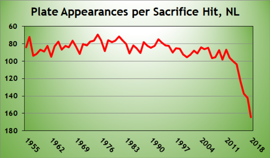
The reason that I’m looking at only National League teams, of course, is the presence of the designated hitter in the American League. This year there were 564 sacrifices in the National League. That’s the fewest since 1960, when there were only eight teams in the league. The math has always been there: This year, teams could expect to score 0.87 runs with a runner on first base and no outs, and only 0.67 with a runner on second base and one out, so why are you bunting?
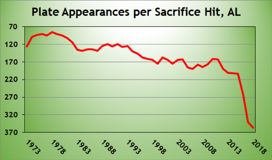
And no, it’s not because of interleague play. Here’s the American League. Same story.
I argued over the winter that maybe we’ve gone too far, and that perhaps pitchers should be bunting more. Obviously, it didn’t happen in 2018. It may not be the best strategy, but man, does it make for some fun graphs.
Thank you for reading
This is a free article. If you enjoyed it, consider subscribing to Baseball Prospectus. Subscriptions support ongoing public baseball research and analysis in an increasingly proprietary environment.
Subscribe now
I say this because during the NL playoffs I remember two occurrences where there was a lead-off double during a close/late/extra inning scenario...yet no bunting over to 3rd.