The Washington Nationals won the World Series but their logo is still the Walgreens logo, so it’s a wash. Countless times Anthony Rendon started to turn a double play and fans were transported to the pharmacy line waiting to refill their Ambien. Searching in vain for the Oreo Lemon Crème Sandwich Cookies they sold for two weeks and never again. Singing along to the album(?) version of “This Kiss” for some reason.
Unstoppable.
Emblems are too powerful. Unfair subconscious associations are plentiful. The Nationals did not even make the list below — there are actually ten worse logos in MLB history.
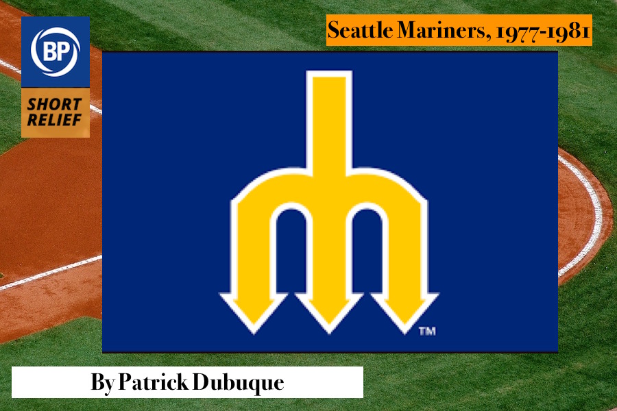
The original Mariners logo is hardly the worst in sports. In terms of combining iconography with theme, it’s actually nearly unparalleled (the Brewers mitt is superior aesthetically, but it doesn’t have the same tie with brewing as the trident does with the sea). No, the real problem is that font, more noticeable on the jerseys, but inescapable on those lilting sides of the pitchfork. It’s seventies in the exact wrong way, an example of typography doing something because it can rather than because it should.
Look, we all have embarrassing pasts, and this is no worse than others on that list. But the true crime is that this logo, representing the truly dreadful, unwatchable brand of expansion-era Mariners baseball, has been chosen to represent retro, when there’s a far better version just sitting there unused. With sharp lines, and the yellow as an actual accent color! One that actual players you might remember wore! It’s almost impossible to find the star on a cap, and that’s a shame.
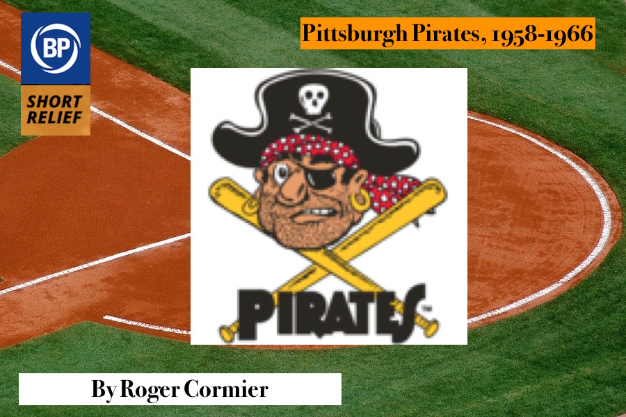
I am not a film buff, so I cannot confidently tell you how many Bing Crosby-Bob Hope films used pirates as the macguffins in their madcap adventures. Pittsburgh minority owner Crosby definitely liked the look of one of the very hungover extras though. Heck, the star himself might have aided the thespian the night before with his discombobulated, rudely-sobered-up-right-quick unshaven look screaming “Hell, I have to remember a line now, Bingo?” It is the only explanation I could think of for the Pirates using the above as an insignia for nine years.
The joke, with the precision timing you would find from a Hope quip involving golf for some reason, is how the odd choice of a logo brought the franchise good fortune. The Pirates won 22 more games in 1958 than the season before, and their dramatic World Series triumph in 1960 over the Yankees is a constant reminder that the true buried treasure is the drinking buddies we made all along the way.
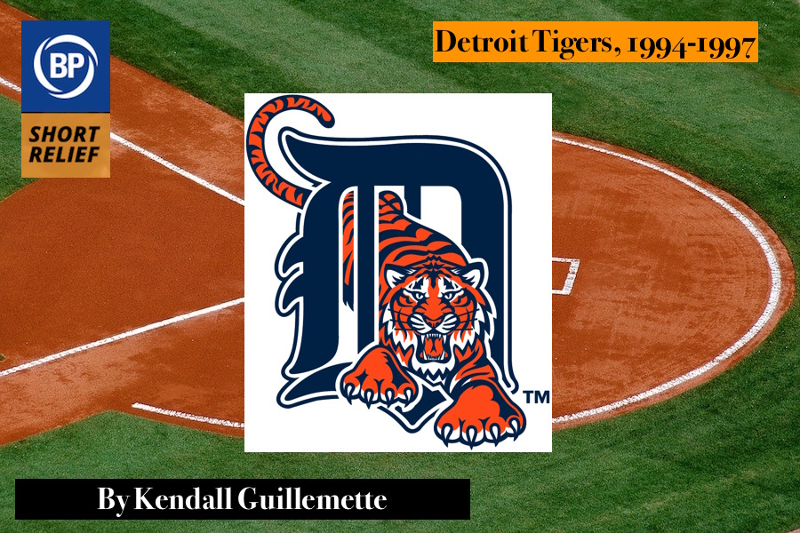
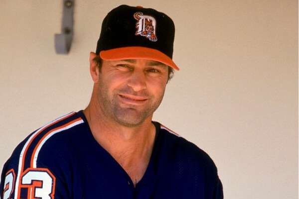
The mid-nineties were aesthetically challenging for all of us, but particularly for the Detroit Tigers. Coming off a 29 year run of a beautiful illustrated tiger face encircled with the team name in blue (sports design royalty Todd Radom called it “The Thumbprint” because it was technically difficult to reproduce, especially at small sizes), the Tigers moved to a cartoonish tiger prowling through the Old English D. I can scrape the crevices of my soul to find enough generosity to say that the tiger was escaping through the bars of a cage. For me, that’s too clever by half and is sure asking a lot of the viewer of a team’s logo. From 1994-1997 the team even dared to place that on their caps. Kirk Gibson couldn’t even make it look cool.
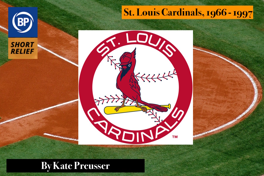
First, to be clear: with the classic “birds on the bat” logo, I have no quibble. The bat is a natural perch; the balance of the two birds on either end has a pleasing symmetry; the story of the woman who created the inspiration for the logo, Allie May Schmidt, is charming in a perfectly Midwestern way (dioramas, luncheons, Presbyterianism; Franzen aches for this authenticity). In the late 60s, however, buoyed by the team’s success, the Cardinals began the process of straying ever further from Ms. Schmidt’s light. The gentle Scandinavian charm of the original red birds was superseded as the Cardinals began pushing this puffed-up popinjay as a primary logo. The font, echoing the shape of the recently-completed Gateway Arch, is fine; what is not fine is this brazen birdlet, this affront with wings, this avian rapscallion. What business have you, little saucebox, smirking and strutting in such a manner? What borrowed glory tilts your cap at such a rakish angle, insistent monochrome, all pucker and snip? The dark wound of your beard is an obscenity. Begone with your puffed-out chest and waterfall of feathers pooling over the bat handle. I’m not even sure that’s how feathers work, you indefatigable and unabashed reprobate, and your feet are certainly not how feet work, not birdfeet nor peoplefeet nor any feet known to this great green Earth, and probably not neither those collections of dust and heat and gaseous poisons called planets. Your toes are uneven both in number and size, and wholly improper. Insouciant cyclops oculus, you think you are better than me. You are not.
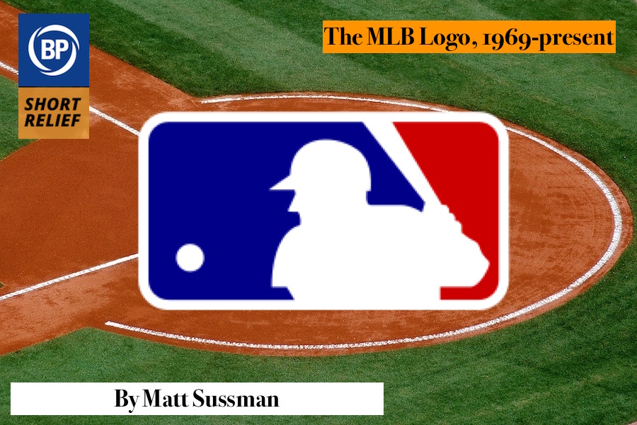
Look, it’s obviously a baseball player preparing to swing a baseball bat at a pitched baseball. The pitch itself is way too high, nearly chin-high, and it’s entirely possible the pitcher is throwing high and tight.
The batter isn’t even offering at the pitch, which shows plate discipline, but is a good eye for a strike really what you want to personify in a major sports league? At least the MLB Players Union has a batter swinging.
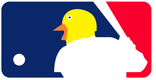
Lack of action notwithstanding, the color scheme is a bit bland. But of course, most of all, the batter is not actually human but rather a duck.
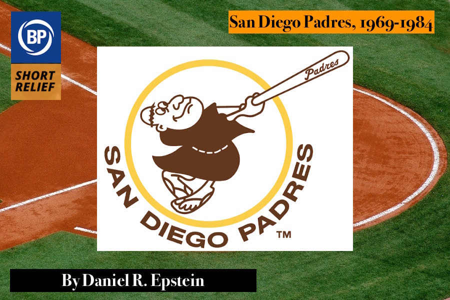
This monstrosity was the Padres’ primary logo for their first 15 years. The brown, white, and yellow combination is extremely 1970s, which I suppose is okay given the time frame, but looks gross by modern standards.
The bat-wielding friar is the real story. Don’t be fooled by the object in his hands — this is the most unathletic character in the history of sports logos. He’s not even swinging it so much as prevent it from flying away. Look closely at his grip, and he appears to be missing several fingers and possibly the entirety of his left hand.
At best, he suffers from a severely dislocated right knee. Wherever you’re reading this, stand up and try to position your legs to match the friar’s. It can’t be done without something bending in the wrong direction. That’s what happens when you play baseball in flip flops.
His butternut squash-shaped head is most disconcerting of all. His mouth looks large enough to swallow a whole cantaloupe. The eyes appear to be stolen from Mr. Potato Head, with similar detachability. There are three possibilities for what’s going on up top:
- The worst haircut ever.
- Some kind of large eggshell instead of a helmet?
- He’s the victim of a scalping.
Whatever it is, the shape of his cranium has to cause profound neurological impairments. With his brain contorted to fit its cramped confines, it’s no wonder he only survived 15 years. Hopefully, he’s enjoying his second act as Hufflepuff house ghost.
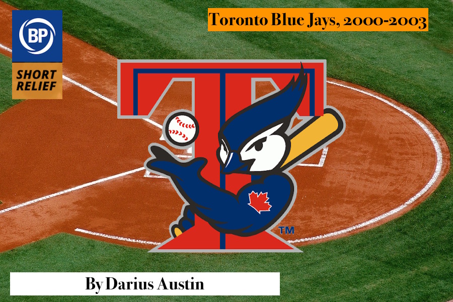
This bird spent the 90s watching the home run rate soar and dreaming of becoming a major league slugger. This bird perched in front of the TV, engrossed by Mark McGwire and Sammy Sosa’s home run battle for the ages. This bird looks like it could have given Barry Bonds a run for his money in 2001. There’s an argument to be made that, as terrible as it is, this is the perfect logo for the era during which it was employed.
It’s probably no coincidence that the logo was also extremely short-lived. The jacked-up blue jay only stuck around for four years and was in fact the team’s primary logo for 2003 alone. This bird wanted to emulate McGwire and Sosa and Bonds so much, it underwent a radical, unnatural transformation. Gone is the classic blue jay in profile. After a trip to BALCO, that blue jay has grown arms and hands. Essential, of course, in order to swing a bat and get a maple leaf tattoo on your rippling biceps. We can’t see what bizarre effect this chemical enhancement has had on the legs (possibly none at all — this bird skips leg day).
Frankly, it’s unsettling, and a little menacing too. Lurking behind that T, it might simply be planning to sock a bunch of dingers, but it looks more like it’s about to graphically describe what will happen if you snitch to the USADA about what you found in its nest. At least it distracts from the T itself, a feature almost as bizarrely-proportioned as the bird itself, not aided by the blue “central” lines that suggest the very real possibility that the designer forgot to add the color until five minutes before the logo was submitted. The insipid, inconsistent gray outline only strengthens the idea that the planning stage only got as far as “What if a blue jay could hit a ball 500 feet?”
In 2002, the federal investigation of BALCO commenced. By the following year, investigators had hard proof of numerous athletes using THG distributed by their lab. The BALCO Blue Jay was gone after that one season in the limelight, never to be seen again.
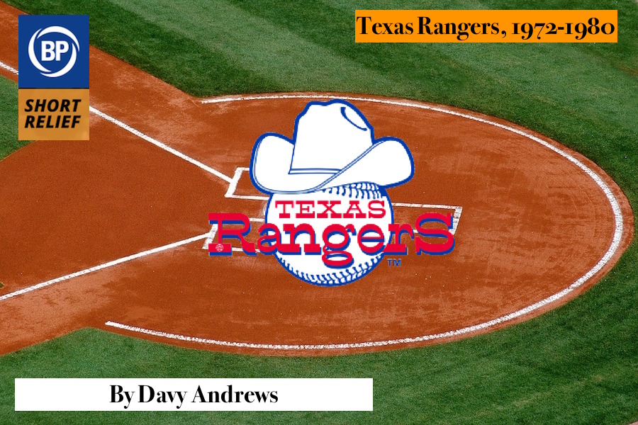
OWNER: I’m just going to ask — and truly, I mean no disrespect—but you’re…you are an artist, right?
DESIGNER: I am an artist.
OWNER: And you went to art school?
DESIGNER: Art school, yes.
OWNER: And you…you graduated from art school?
DESIGNER: Sure.
OWNER: Ok, thank you for indulging me. Can you run this by me one more time? I feel like I might be missing something.
DESIGNER: It’s a baseball with a hat on it.
OWNER: Ok, so I’m not missing anything.
[Long, uncomfortable silence.]
OWNER: Just out of curiosity, how long did this design take you? From the initial concept to the final, finished product I now hold in my hand on this cocktail napkin.
DESIGNER: Well this would be an estimate—
OWNER: Of course.
DESIGNER: Because art is not amenable to pulling out a stopwatch and just, just—
OWNER: I completely—
DESIGNER: You know, when Michelangelo frescoed the Sistine Chapel it’s not as if the Pope was badgering him all the time to get a move on and—
OWNER: They literally made a movie about that just a few years ago. Did you not see the movie? I would’ve thought it was right up your alley.
DESIGNER: But I would say maybe twelve to fifteen seconds.
[Long, surprisingly comfortable silence.]
OWNER: What I’m wondering — and I want to make sure that I communicate this with sensitivity — we’re a brand new team. People have never heard of the Texas Rangers. So we need a logo that tells them who we are. And I’m wondering, when I look at this logo, does it say to me: These are the Texas Rangers?
DESIGNER: Hmm.
OWNER: And the answer comes back to me: “It’s a baseball with a hat on it.”
[Long, at this point friendly silence.]
OWNER: You know, I’m thinking about the colors.
DESIGNER: Hmm.
OWNER: The seams on the baseball, why aren’t they red?
DESIGNER: I’m sorry?
OWNER: A baseball’s seams, they’re red. You went with blue, and I just wondered—you know, I’m not the artist—
DESIGNER: Oh, barf.
OWNER: Pardon?
DESIGNER: That’s on me. I must have spaced.
OWNER: You spaced? During the twelve seconds it took you to design this—
DESIGNER: Twelve to fifteen.
OWNER: You spaced?
DESIGNER: They should really be red.
OWNER: Would you like to revise the design? Should we change it?
DESIGNER: Nah, I’m all out of cocktail napkins.
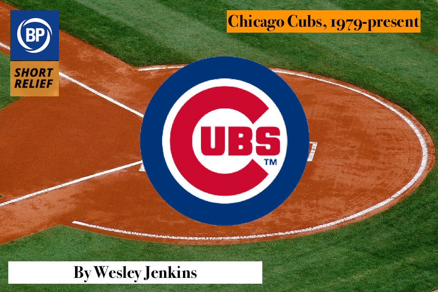
If any organization could look at the copyright symbol and think, “You know, with some fair use modifications and a healthy dose of red because nobody even acknowledges nuance these days, this thing could really stand for our organizational principles,” it would be the Cubs. I look upon this cursed logo and scream, “The foul ball was in the public domain, Moisés! Bartman had every right!”
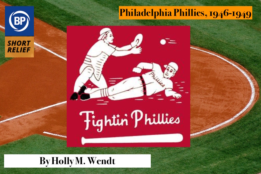
It’s not so much a logo as a scene, and it’s a bad scene. There’s a catcher and a ball in motion, which should offer up a veneer of excitement, but even an over-generous flight of speed-lines can’t make up for the oppressive hokiness emanating from every facet of the thing. The Phillies player’s lead foot is very nearly to the catcher’s, which is where one assumes home plate to be (as I imagine this old-school backstop to be blocking the plate), which encourages me to believe that the runner will be safe by a fair bit. This is all to say: the designer’s gone to all this trouble to create a play at the plate, and it’s a yawn. The boredom of it all is exacerbated by the milquetoast faces, the blunt simplicity of the poses, the fact that the piece has no discernible boundary, no frame. There’s only a red square, suggesting an ongoing field, which is the primary reason that this is somehow even worse than the 1976-1980 ridiculousness with the children in historical garb. How is this thing even considered a logo in the first place?
Maybe I’m being too hard on this chalky inelegance, this sweet, simple try-hard sketch. I do like the rendering of the F, the charming little stars — but that doesn’t fix anything. The crimes against design are absolutely underlined by the bat at the bottom, which is apparently perfectly flat on one side. This thing served as the logo for the Phillies season following the conclusion of the war. Surely such a moment deserves better than this.
Thank you for reading
This is a free article. If you enjoyed it, consider subscribing to Baseball Prospectus. Subscriptions support ongoing public baseball research and analysis in an increasingly proprietary environment.
Subscribe now
most unathletic character in the history of sports
That’s what happens when you play baseball in flip flops.
the shape of his cranium has to cause profound neurological impairments.
Those are your words not mine. You made the argument yourself and didn't even realize it.